
401 Model Quick links
Ready to raise your investing IQ?
Sign up for our Free Newsletter to access the best investment information money can’t buy.
The 401(k) Allocation Model (401 Model) is designed to optimize retirement portfolio performance by dynamically adjusting allocations between stock and bond funds based on prevailing market conditions. Unlike traditional static investment strategies, the 401 Model actively reallocates assets to capitalize on growth opportunities during economic expansions and to preserve capital during downturns.
To assess its effectiveness, we compare the 401 Model’s performance against several benchmarks, including a 100% S&P 500 portfolio (SPY), a 100% bond portfolio (AGG), and a traditional 60/40 stock-bond portfolio.
The table below presents key performance metrics over a 26-year period (2000–2025), providing insights into return potential, volatility, and risk-adjusted performance. Each metric is analyzed in detail to illustrate how the 401 Model outperforms conventional investment strategies.
| 401 Model Performance Metrics | ||||||||
|---|---|---|---|---|---|---|---|---|
| Strategy | Compound Annual Return | Alpha1 | Beta1 | Standard Deviation | Maximum Drawdown | Sharpe Ratio | Sortino Ratio | Treynor Ratio |
| 401 Model | 10.02% | 5.55% | 0.40 | 11.0% | -22.9% | 0.78 | 1.74 | 0.22 |
| SPY (S&P 500) | 7.99% | 0.00% | 1.00 | 17.9% | -50.8% | 0.43 | 0.48 | 0.08 |
| AGG (Bonds) | 3.88% | N/A | 0.00 | 4.8% | -17.1% | 0.43 | 0.51 | N/A |
| 60/40 Stocks/Bonds | 6.78% | 1.17% | 0.54 | 10.2% | -23.9% | 0.52 | 0.64 | 0.10 |
| Data for 26-Year Period (2000 – 2025) 1 Benchmarked against the S&P 500 |
||||||||
Definition: The Compound Annual Return (CAR) represents the mean annual growth rate of an investment over a specified period, assuming the reinvestment of profits. It provides a standardized measure to compare the performance of different investment strategies over time.
Interpretation: A higher CAR indicates a more robust growth trajectory, reflecting the strategy’s effectiveness in generating consistent returns. Investors often prefer strategies with elevated CARs, as they suggest efficient capital appreciation.
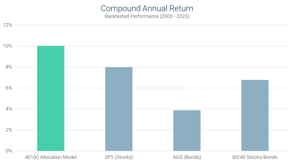
401 Model’s Performance: Over the 26-year period from 2000 to 2025, the 401 Model achieved a CAR of 10.02%, significantly outperforming the S&P 500’s 7.99%. This performance underscores the 401 Model’s ability to dynamically allocate between stocks and bonds, thereby enhancing overall portfolio growth.
Definition: Alpha measures the excess return of an investment relative to the return of a benchmark index, such as the S&P 500. It indicates the value that a strategy adds beyond market movements, adjusted for volatility.
Interpretation: A positive alpha indicates the strategy outperforms the benchmark after accounting for volatility. A negative alpha indicates underperformance, while a zero alpha implies in-line performance with the benchmark.
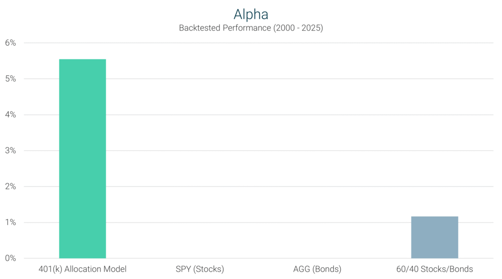
401 Model’s Performance: The 401 Model recorded an alpha of 5.55%, indicating it delivered returns substantially above what would be expected based on its volatility. This positive alpha reflects the model’s proficiency in asset allocation and timing.
Definition: Beta measures how an investment responds to overall market movements. It quantifies the relationship between an asset’s returns and the broader market, typically using the S&P 500 as a benchmark.
Interpretation: A beta less than 1.0 means the strategy is less volatile than the market, while a beta greater than 1.0 indicates more volatility than the market.
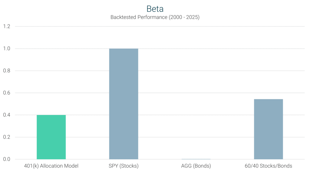
401 Model’s Performance: With a beta of 0.40, the 401 Model exhibits significantly lower sensitivity to market movements compared to the S&P 500’s beta of 1.0. This reduced beta indicates that the model is less affected by market volatility, contributing to a more stable investment experience.
Definition: Standard Deviation quantifies the dispersion of an investment’s returns around its average. A higher standard deviation indicates greater variability in returns, signifying higher risk.
Interpretation: Investors seeking stability prefer strategies with lower standard deviations, as they offer more predictable returns.
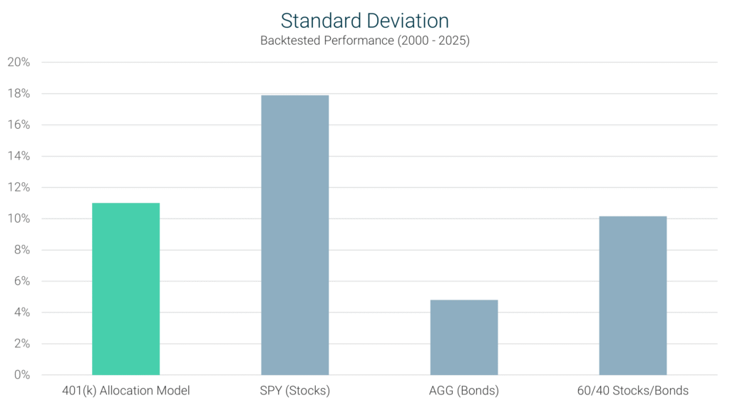
401 Model’s Performance: The 401 Model’s standard deviation is 11.0%, which is lower than the S&P 500’s 17.9%. This suggests that the model provides a more consistent return pattern, reducing the uncertainty associated with investment outcomes.
Definition: Maximum Drawdown measures the largest peak-to-trough decline in an investment’s value over a specified period. It reflects the most significant loss an investor could experience before a recovery to the previous peak.
Interpretation: A smaller maximum drawdown is preferable, as it indicates the strategy’s effectiveness in preserving capital during market downturns.
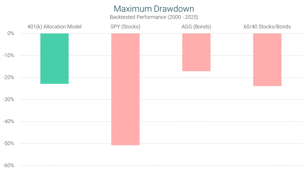
401 Model’s Performance: The 401 Model experienced a maximum drawdown of -22.9%, significantly less severe than the S&P 500’s -50.8%. This demonstrates the model’s capability to mitigate losses during adverse market conditions.
Definition: The Sharpe Ratio evaluates an investment’s return relative to its total risk, measured by standard deviation. It helps investors determine how efficiently a strategy generates returns for the level of risk taken.
Interpretation: A higher Sharpe Ratio indicates that a strategy is providing better risk-adjusted returns, meaning investors are rewarded more effectively for the risk they take on. Lower Sharpe Ratios suggest that returns are not as well-optimized in relation to volatility.
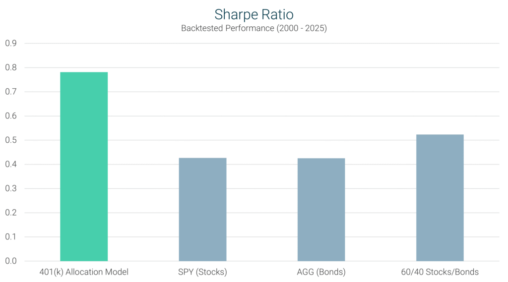
401 Model’s Performance: The 401 Model achieved a Sharpe Ratio of 0.78, outperforming the S&P 500’s 0.43, proving that it delivers higher returns per unit of risk taken.
Definition: The Sortino Ratio is similar to the Sharpe Ratio but focuses only on downside risk, rather than total volatility. It measures how effectively a strategy generates returns while avoiding major losses.
Interpretation: A higher Sortino Ratio suggests the strategy is delivering strong performance while minimizing downside volatility, making it a good choice for risk-conscious investors. A lower Sortino Ratio indicates a strategy may be exposing investors to more downside risk.

401 Model’s Performance: The 401 Model posted a Sortino Ratio of 1.74, far surpassing the S&P 500’s 0.48, showing that it delivers superior returns while actively managing downside risk.
Definition: The Treynor Ratio evaluates an investment’s return relative to its exposure to systematic market risk, as measured by Beta.
Interpretation: A higher Treynor Ratio suggests the strategy generates superior returns per unit of market risk taken. A lower Treynor Ratio means the strategy is not efficiently converting market exposure into excess returns.
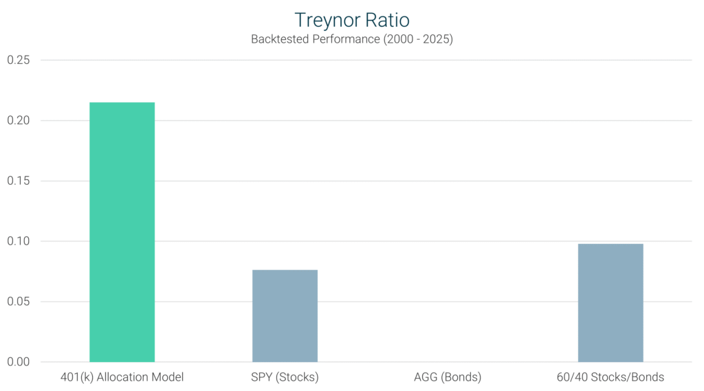
401 Model’s Performance: The 401 Model achieved a Treynor Ratio of 0.22, outperforming the S&P 500’s 0.08, reinforcing its ability to maximize returns while maintaining lower market exposure.
The 401(k) Allocation Model (401 Model) has demonstrated exceptional performance across key investment metrics, making it a perfect fit for employer-sponsored retirement plans.
By actively adjusting allocations, the 401 Model has consistently outperformed the S&P 500 with significantly smaller drawdowns, proving that a strategic, rules-based approach can deliver superior results compared to traditional set-it-and-forget-it 401(k) allocations.
For anyone looking to get more growth out of their 401(k) without taking on unnecessary risk, the 401 Model offers a smarter, more effective way to invest within employer-sponsored retirement funds – ensuring a more secure and prosperous financial future.
Maximize your 401(k) today – sign up and start your free trial!
Sign Up Now for Access to the 401(k) Allocation Model!
The information provided here is for informational purposes only. Model returns do not reflect any management fees, transaction costs or expenses. Investing involves a great deal of risk, including the loss of all or a portion of your investment. Nothing contained herein should be construed as a warranty of investment results. Past performance is not an indication of future results. All risks, losses and costs associated with investing, including total loss of principal, are your responsibility. Model Investing maintains positions in the funds discussed within this site according to model recommendations.