ARM Quick links
Start your free monthReady to raise your investing IQ?
Sign up for our Free Newsletter to access the best investment information money can’t buy.
The Asset Rotation Model (ARM) is designed to optimize portfolio performance by dynamically shifting between stocks and bonds based on market conditions. Unlike static investment strategies, the ARM actively adjusts allocations to maximize returns while reducing exposure to significant market downturns.
To evaluate its effectiveness, we compare the ARM’s performance against traditional investment approaches, including a 100% S&P 500 portfolio, a 100% bond portfolio (AGG), and a traditional 60/40 stock-bond portfolio.
The table below highlights key performance metrics over a 26-year period (2000–2025), providing insight into return potential, volatility, and risk-adjusted performance. Each metric is then analyzed in greater detail to illustrate how the ARM outperforms conventional strategies.
| Asset Rotation Model (ARM) Performance Metrics | ||||||||
|---|---|---|---|---|---|---|---|---|
| Strategy | Compound Annual Return | Alpha1 | Beta1 | Standard Deviation | Maximum Drawdown | Sharpe Ratio | Sortino Ratio | Treynor Ratio |
| ARM | 9.77% | 4.56% | 0.51 | 11.7% | -21.9% | 0.72 | 1.25 | 0.17 |
| SPY (S&P 500) | 7.99% | 0.00% | 1.00 | 17.9% | -50.8% | 0.43 | 0.48 | 0.08 |
| AGG (Bonds) | 3.88% | N/A | 0.00 | 4.8% | -17.1% | 0.43 | 0.51 | N/A |
| 60/40 Stocks/Bonds | 6.78% | 1.17% | 0.54 | 10.2% | -23.9% | 0.52 | 0.64 | 0.10 |
| Data for 26-Year Period (2000 – 2025) 1 Benchmarked against the S&P 500 |
||||||||
Definition: Compound Annual Return (CAR) represents the average annual growth rate of an investment over time, assuming profits are reinvested each year. It provides a clear picture of long-term performance by smoothing out short-term fluctuations.
Interpretation: A higher CAR indicates stronger long-term growth. A strategy with a higher CAR is generally preferable, as it demonstrates consistent compounding over time.
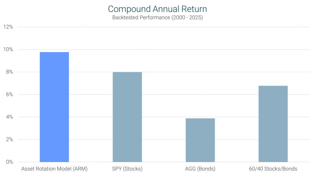
ARM’s Performance: Over the 26-year period (2000–2025), the ARM achieved a CAR of 9.77%, significantly outperforming the S&P 500’s 7.99% and the 60/40 portfolio’s 6.78%. This suggests that the ARM’s dynamic allocation strategy has provided superior long-term growth compared to static investment approaches.
Definition: Alpha measures an investment strategy’s ability to generate returns above what would be expected based on its volatility. It assesses whether a strategy adds value beyond standard market movements.
Interpretation: A positive alpha indicates the strategy outperforms the market on a risk-adjusted basis. A negative alpha suggests underperformance after accounting for risk exposure, while an alpha of zero means the strategy performs exactly as expected given its risk level.
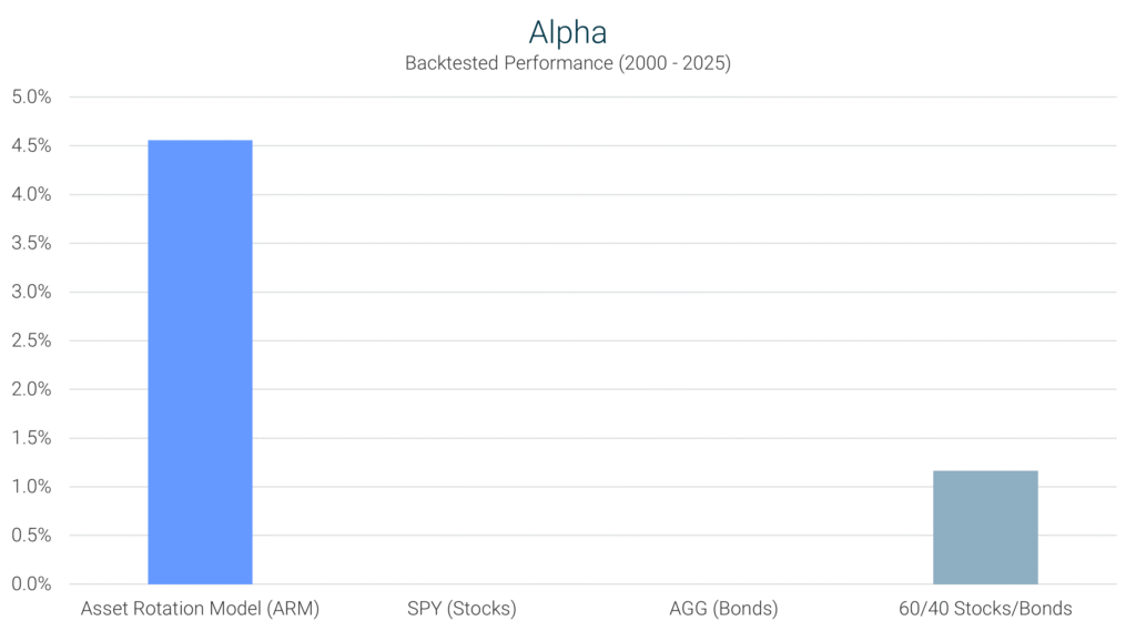
ARM’s Performance: The ARM posted an alpha of 4.56%, meaning it outperformed the market beyond what would be expected based on the strategy’s volatility. This shows that the ARM isn’t just tracking the market – it’s actively adding value beyond what typical market conditions would suggest.
Definition: Beta measures an investment’s sensitivity to overall market movements. It compares how an asset or strategy moves relative to a benchmark, typically the S&P 500 (which has a Beta of 1.0). Beta helps investors understand whether a strategy is more or less volatile than the market.
Interpretation: A beta of 1.0 means the investments moves in lockstep with the market. A beta greater than 1.0 indicates the strategy is more volatile than the market, while a beta less than 1.0 suggests the investment is less volatile, offering more downside protection.
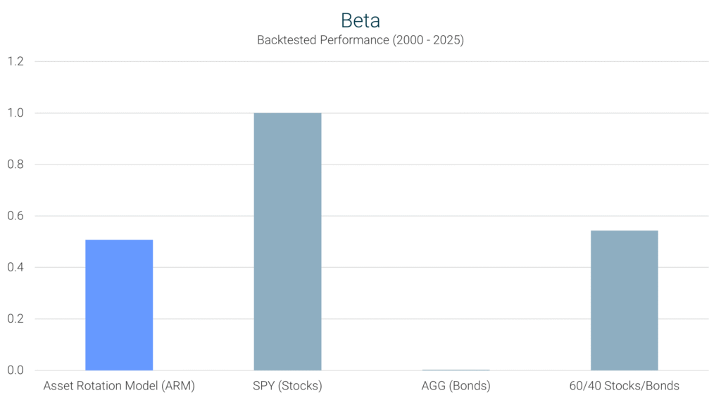
ARM’s Performance: The ARM recorded a beta of 0.51, significantly lower than the S&P 500’s 1.0. This suggests that the ARM experiences less market volatility, reducing exposure to sharp market declines while still capturing growth opportunities.
Definition: Standard deviation measures how much an investment’s returns fluctuate over time. A higher standard deviation indicates greater volatility, meaning the investment experiences larger swings in value.
Interpretation: Lower standard deviation is preferred for risk-averse investors, as it reflects more stable and predictable returns.
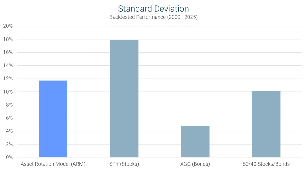
ARM’s Performance: The ARM recorded a standard deviation of 11.7%, significantly lower than the S&P 500’s 17.9%, meaning it experienced much less volatility. While slightly higher than the 60/40 portfolio’s 10.2%, the ARM still provided an excellent tradeoff between risk and reward.
Definition: Maximum drawdown measures the largest peak-to-trough decline an investment experiences before recovering. This metric highlights the worst-case scenario for an investor in terms of portfolio loss.
Interpretation: A lower maximum drawdown is better because it indicates less severe losses during market downturns, helping investors preserve capital.
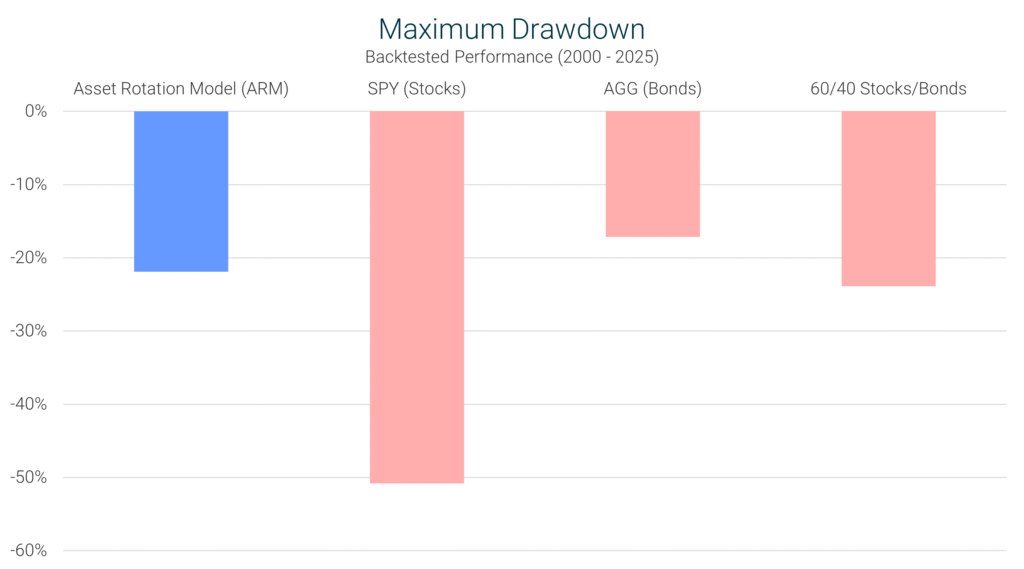
ARM’s Performance: The ARM’s maximum drawdown of -21.9% was significantly smaller than the S&P 500’s -50.8%, demonstrating superior downside protection. Even compared to the 60/40 portfolio’s -23.9%, the ARM provided a slightly better risk buffer.
Definition: The Sharpe Ratio measures an investment’s return relative to its risk. It is calculated by taking the excess return (above the risk-free rate) and dividing it by the investment’s volatility (standard deviation).
Interpretation: A higher Sharpe ratio is desirable, as it indicates better returns for each unit of risk taken.
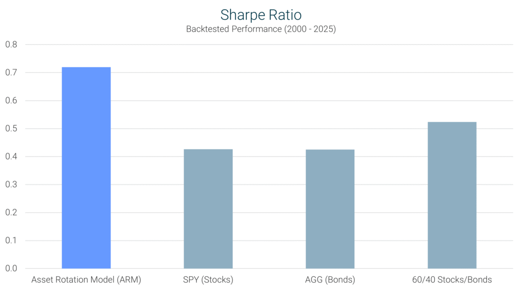
ARM’s Performance: The ARM’s Sharpe ratio of 0.72 was well above the S&P 500’s 0.43 and the 60/40 portfolio’s 0.52, meaning it provided more efficient risk-adjusted returns than either benchmark.
Definition: The Sortino Ratio is similar to the Sharpe Ratio but focuses only on downside risk, ignoring upward fluctuations that benefit investors.
Interpretation: A higher Sortino Ratio is preferable, as it indicates better performance relative to downside volatility (bad risk).

ARM’s Performance: With a Sortino Ratio of 1.25, the ARM significantly outperformed the S&P 500 (0.48) and the 60/40 portfolio (0.64), showing that it effectively delivered strong returns while minimizing downside risk.
Definition: The Treynor Ratio measures returns relative to an investment’s exposure to systematic (market) risk, as represented by Beta.
Interpretation: A higher Treynor Ratio is better because it indicates that the strategy efficiently generates returns relative to its level of market risk.
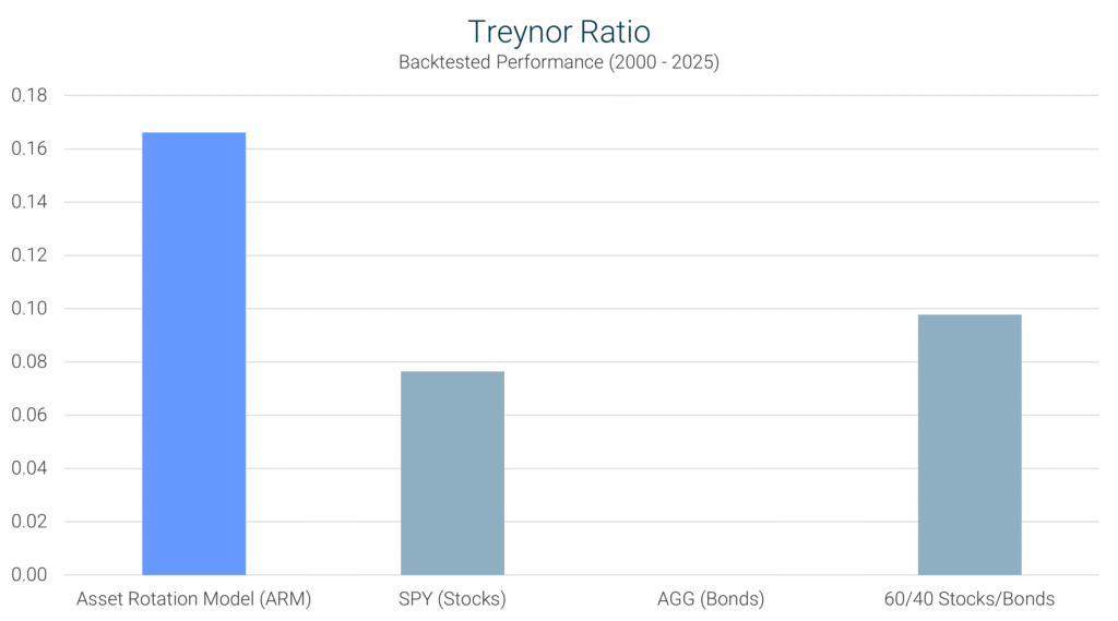
ARM’s Performance: The ARM posted a Treynor Ratio of 0.17, outperforming both the S&P 500 (0.08) and the 60/40 portfolio (0.10), meaning it delivered higher returns per unit of market risk.
The Asset Rotation Model (ARM) has demonstrated exceptional performance across multiple key investment metrics, offering a powerful combination of strong returns, lower risk, and superior risk-adjusted efficiency.
The ARM is not just about higher returns – it is about achieving those returns more efficiently and with less risk exposure. By dynamically adjusting its allocations between stocks and bonds, it captures market upside while minimizing drawdowns during volatile periods.
For investors seeking strong growth, lower volatility, and a strategy that actively enhances performance over time, the ARM presents a compelling alternative to traditional investment approaches.
Take control of your portfolio today – sign up and start your free trial!
Sign Up Now for Access to the Asset Rotation Model!
The information provided here is for informational purposes only. Model returns do not reflect any management fees, transaction costs or expenses. Investing involves a great deal of risk, including the loss of all or a portion of your investment. Nothing contained herein should be construed as a warranty of investment results. Past performance is not an indication of future results. All risks, losses and costs associated with investing, including total loss of principal, are your responsibility. Model Investing maintains positions in the funds discussed within this site according to model recommendations.