SRM Quick links
Start your free monthReady to raise your investing IQ?
Sign up for our Free Newsletter to access the best investment information money can’t buy.
The Sector Rotation Model (SRM) is designed to enhance returns by strategically reallocating investments across market sectors based on prevailing economic and market conditions. Unlike passive investment strategies, the SRM actively adjusts sector exposure to capture growth opportunities and avoid weaker-performing sectors.
To assess its effectiveness, we compare the SRM’s performance against the S&P 500, the primary benchmark for stock market performance.
The table below presents key performance metrics over a 26-year period (2000–2025), offering insight into return potential, volatility, and risk-adjusted efficiency. Each metric is analyzed in detail to illustrate how the SRM delivers superior performance compared to conventional investment strategies.
| Sector Rotation Model (SRM) Performance Metrics | ||||||||
|---|---|---|---|---|---|---|---|---|
| Strategy | Compound Annual Return | Alpha1 | Beta1 | Standard Deviation | Maximum Drawdown | Sharpe Ratio | Sortino Ratio | Treynor Ratio |
| SRM | 10.14% | 6.71% | 0.27 | 12.3% | -19.6% | 0.71 | 2.51 | 0.32 |
| SRM + ARM | 11.44% | 8.32% | 0.22 | 11.5% | -19.6% | 0.87 | 5.25 | 0.45 |
| SPY (S&P 500) | 7.99% | 0.00% | 1.00 | 17.9% | -50.8% | 0.43 | 0.48 | 0.08 |
| Data for 26-Year Period (2000 – 2025) 1 Benchmarked against the S&P 500 |
||||||||
Definition: Compound Annual Return (CAR) measures the average annual growth rate of an investment, assuming profits are reinvested each year. It smooths out fluctuations, providing a clear picture of long-term performance.
Interpretation: A higher CAR indicates stronger long-term growth, making it a key factor for investors focused on wealth accumulation.
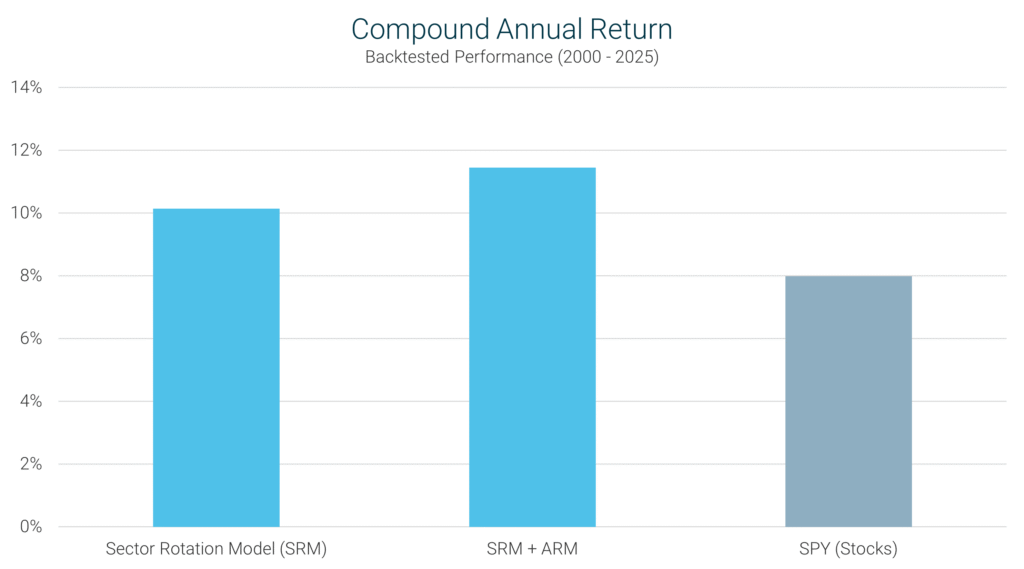
SRM’s Performance: Over the 26-year period (2000–2025), the SRM achieved a CAR of 10.14%, significantly outperforming the S&P 500’s 7.99%. This highlights the SRM’s ability to identify and invest in top-performing sectors, leading to superior long-term returns.
Definition: Alpha measures an investment’s ability to generate returns beyond what would be expected based on its volatility. It quantifies the value added by a strategy beyond market movements.
Interpretation: Positive alpha means the strategy is delivering excess returns. Negative alpha indicates underperformance relative to volatility. Zero alpha suggests the strategy is performing as expected given its risk level.
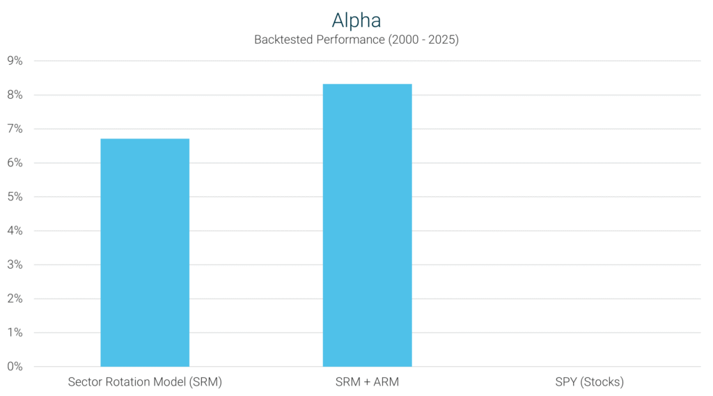
SRM’s Performance: The SRM posted an alpha of 6.71%, meaning it delivered returns well above what its volatility would predict. This demonstrates the model’s effectiveness in selecting the best-performing sectors and actively adding value beyond a simple market-tracking strategy.
Definition: Beta measures how an investment reacts to market movements. A beta of 1.0 means the investment moves in sync with the market, while a lower or higher beta indicates reduced or increased sensitivity to market fluctuations.
Interpretation: A beta > 1.0 means the strategy is more volatile than the market. A beta < 1.0 means the strategy is less volatile and provides more stability.
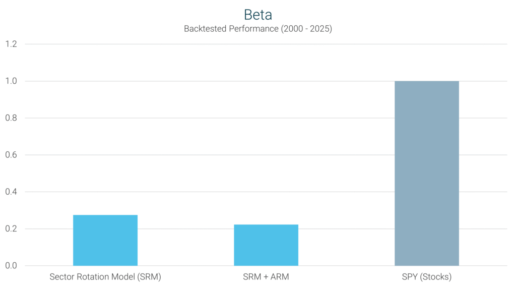
SRM’s Performance: With a beta of 0.27, the SRM exhibits significantly lower sensitivity to market swings than the S&P 500’s beta of 1.0. This means the SRM reduces market risk exposure while capturing greater upside potential.
Definition: Standard deviation quantifies how much an investment’s returns fluctuate over time. A higher standard deviation indicates more volatility, while a lower one suggests greater consistency.
Interpretation: Lower standard deviation is preferred by risk-conscious investors, as it reflects a smoother investing experience.
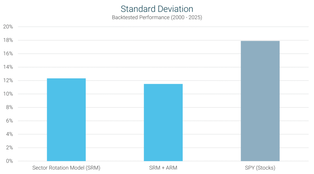
SRM’s Performance: The SRM’s standard deviation of 12.3% is well below the S&P 500’s 17.9%, demonstrating that the model provides strong returns with less volatility than the broad market.
Definition: Maximum drawdown measures the worst peak-to-trough decline in an investment’s value before it recovers. It highlights the most significant historical loss experienced by the strategy.
Interpretation: A smaller maximum drawdown means the strategy is better at limiting losses in market downturns, making it more appealing to investors focused on risk management.
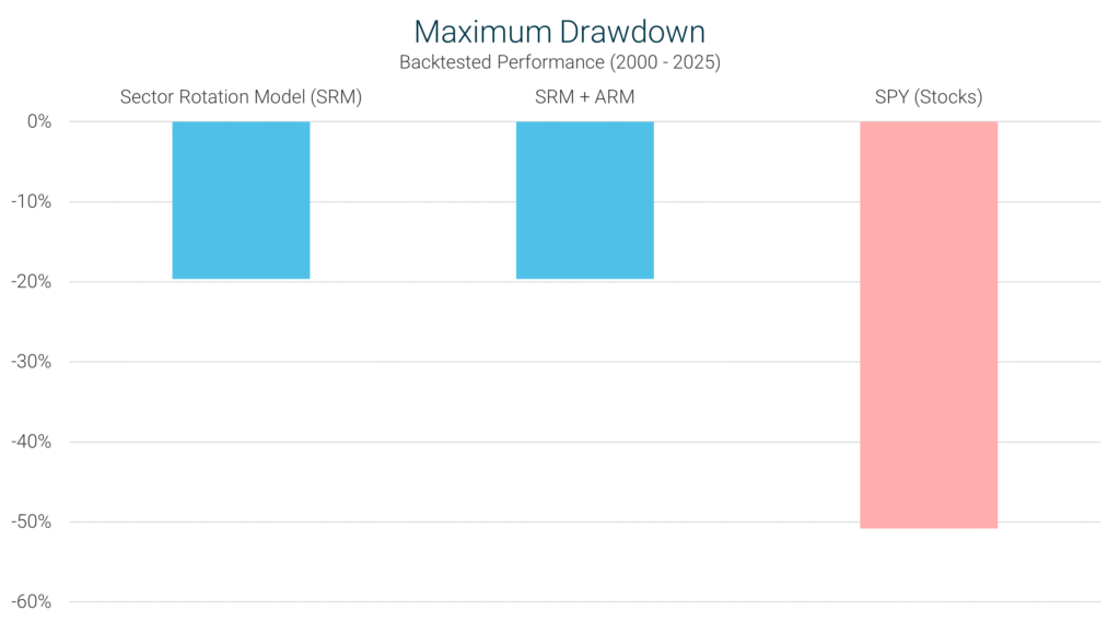
SRM’s Performance: With a maximum drawdown of -19.6%, the SRM has historically experienced far smaller losses than the S&P 500 (-50.8%), reinforcing its ability to protect capital during market declines.
Definition: The Sharpe Ratio evaluates an investment’s return relative to its total risk, measured by standard deviation. It helps investors determine how efficiently a strategy generates returns for the level of risk taken.
Interpretation: A higher Sharpe Ratio indicates better risk-adjusted performance, meaning the strategy delivers higher returns per unit of risk.
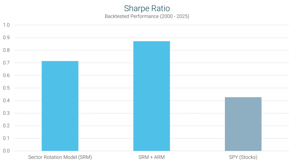
SRM’s Performance: The SRM’s Sharpe Ratio of 0.71 is significantly higher than the S&P 500’s 0.43, confirming that the model delivers better risk-adjusted returns than the overall market.
Definition: The Sortino Ratio is similar to the Sharpe Ratio but focuses only on downside risk, rather than total volatility. It measures how effectively a strategy generates returns while avoiding significant losses.
Interpretation: A higher Sortino Ratio is preferable because it prioritizes downside risk management, making it a useful metric for investors seeking steady, positive returns with lower downside exposure.
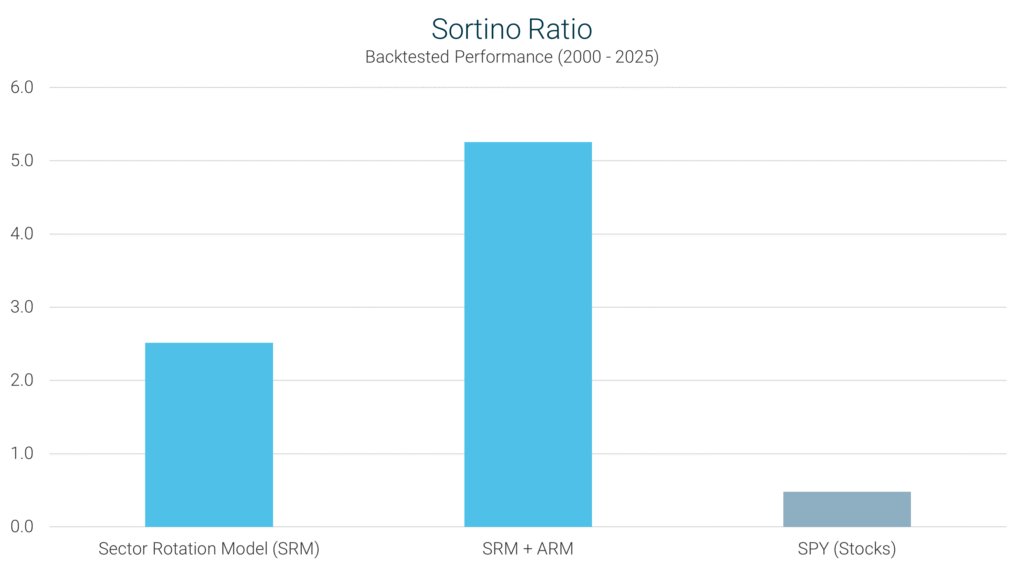
SRM’s Performance: The SRM posted a Sortino Ratio of 2.51, significantly outperforming the S&P 500’s 0.48, proving that the model effectively balances strong returns with reduced downside risk.
Definition: The Treynor Ratio evaluates an investment’s return relative to its systematic market risk, as measured by Beta.
Interpretation: A higher Treynor Ratio suggests that the strategy generates superior returns for the amount of market risk taken, making it ideal for investors looking for efficiency in risk management.
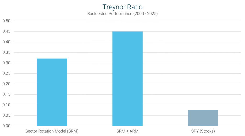
SRM’s Performance: The SRM achieved a Treynor Ratio of 0.32, well above the S&P 500’s 0.08, reinforcing the model’s ability to maximize returns while maintaining lower than market risk exposure.
The Sector Rotation Model (SRM) has demonstrated exceptional performance across multiple investment metrics, delivering strong returns with lower volatility and superior risk-adjusted efficiency. Unlike a traditional market-tracking approach, the SRM actively reallocates investments to capitalize on sector trends, resulting in greater returns while mitigating downside risk.
By consistently identifying the strongest-performing sectors, the SRM has achieved higher growth with significantly lower drawdowns compared to the S&P 500. Its risk-adjusted metrics confirm that it generates superior returns without excessive volatility, making it a compelling alternative to static strategies.
For investors seeking a higher-performing, more resilient strategy, the SRM offers a smarter approach to investing – delivering both growth and stability over time.
Earn higher returns starting today – sign up and start your free trial!
Sign Up Now for Access to the Sector Rotation Model!
The information provided here is for informational purposes only. Model returns do not reflect any management fees, transaction costs or expenses. Investing involves a great deal of risk, including the loss of all or a portion of your investment. Nothing contained herein should be construed as a warranty of investment results. Past performance is not an indication of future results. All risks, losses and costs associated with investing, including total loss of principal, are your responsibility. Model Investing maintains positions in the funds discussed within this site according to model recommendations.