ARM Performance Metrics
The performance of an investment strategy can be measured using a series of basic financial metrics. These industry-standard metrics allow investors to assess both the quality of returns, as well as the amount of risk that a particular strategy has delivered.
We’ve summarized these performance metrics for our Asset Rotation Model (ARM) in the table below. However, unless you happen to be a particularly savvy investor, there’s a good chance you have no idea what all these numbers mean. Not to worry, in this section we’ll break down each of these metrics so that you can get a better understanding of the ARM’s true capabilities.
| Asset Rotation Model (ARM) Performance Metrics | ||||||||
|---|---|---|---|---|---|---|---|---|
| Strategy | Compound Annual Return | Alpha1 | Beta1 | Standard Deviation | Maximum Drawdown | Sharpe Ratio | Sortino Ratio | Treynor Ratio |
| ARM | 8.94% | 4.72% | 0.52 | 11.95% | -19.45% | 0.67 | 1.19 | 0.15 |
| SPY (S&P 500) | 6.18% | 0.00% | 1.00 | 18.29% | -50.81% | 0.34 | 0.39 | 0.06 |
| AGG (Bonds) | 3.78% | N/A | 0.01 | 5.03% | -17.13% | 0.46 | 0.61 | N/A |
| 60/40 Stocks/Bonds | 5.36% | 0.91% | 0.53 | 9.88% | -23.87% | 0.43 | 0.51 | 0.08 |
| Data for 23-Year Period (2000 – 2022) 1 Benchmarked against the S&P 500 | ||||||||
Compound Annual Return
The compound annual return is the rate of return that an investment strategy has achieved over time. It represents the cumulative effect of a series of gains and losses on an original amount of capital. In the chart below, you can see that the ARM has delivered a substantially higher compound annual return than stocks (as measured by the S&P 500), bonds (as measured by the Barclays U.S. Aggregate Bond Index), as well as a blended portfolio containing both stocks and bonds.
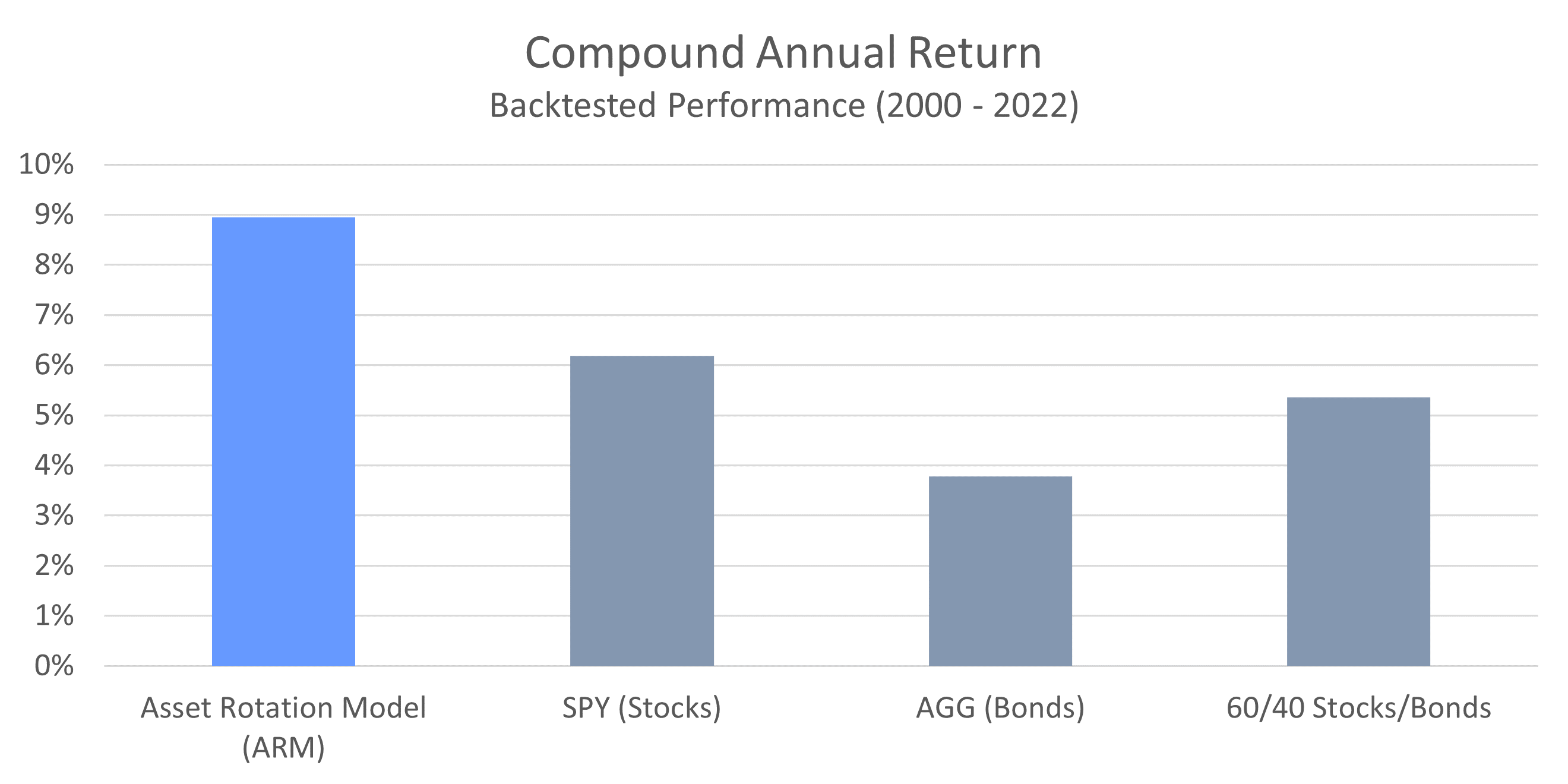
The reason for the ARM’s outperformance stems from the fact that it invests the entire portfolio in either stocks OR bonds at any given time, but not both. During economic expansions, stocks will vastly outperform bonds, while bonds will act as a performance drag. This dynamic reverses during recessions; however, when bonds outperform and stocks tend to suffer. By investing in sync with the business cycle and being more tactical with its portfolio, the ARM takes full advantage of what current market conditions have to offer.
Not only has the ARM vastly outperformed both stocks and bonds from a total return perspective, it has done so while exposing the portfolio to less risk. We can see this by examining the three primary metrics that are used to quantify risk: standard deviation, maximum drawdown, and beta.
Standard Deviation
Standard deviation is the most common measure of risk used in the financial industry. It measures the variability of returns over time. The lower the standard deviation, the more consistent the returns are, and therefore the more “safe” a particular strategy is. A higher standard deviation, on the other hand, implies that returns fluctuate wildly from one year to the next.
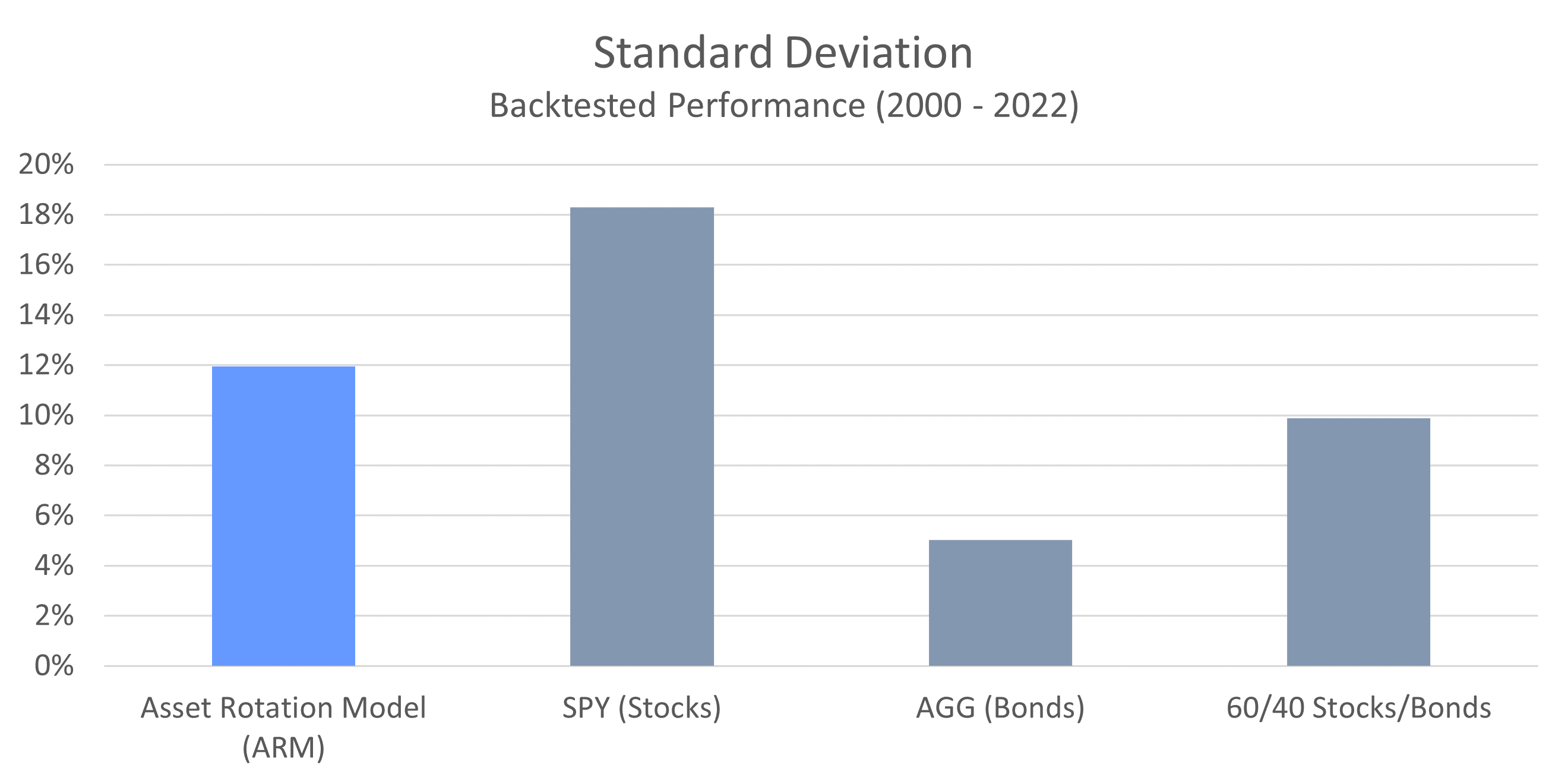
In this chart we can see that the ARM experiences significantly less volatility, or risk, than a portfolio of stocks. The ARM does exhibit more volatility than bonds, as well as a blended portfolio, but that is to be expected and is commensurate with the ARM’s high returns. What’s notable here is that while the volatility of the ARM is not much higher than that of a blended portfolio, the returns are much better (as we saw in the first chart).
Now let’s dig a little deeper and take a look at how high levels of volatility can translate into big losses.
Maximum Drawdown
Maximum drawdown is one of the more intuitive ways to measure risk. It looks at the biggest peak-to-trough decline that an investment strategy has ever experienced. It should come as no surprise that the smaller the maximum drawdown, the better. We can see maximum drawdowns for the ARM and our other portfolios in the chart below.
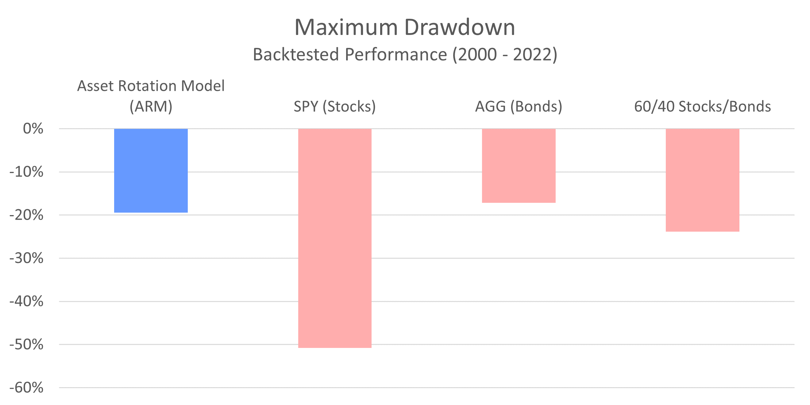
Notice that stocks, as measured by the S&P 500, have experienced drawdowns in excess of 50%. This has actually occurred twice over the last two decades, during the dot-com collapse and again during the financial crisis. The ARM, on the other hand, was able to recognize deteriorating conditions during these treacherous periods and moved the entire portfolio to bonds. As a result, the most the ARM has ever fallen from peak-to-trough is 19.5%. That’s a smaller magnitude decline than even the blended portfolio.
This chart presents one of the most compelling arguments for using the Asset Rotation Model. At this point you should be able to recognize that the ARM allows you to participate in more upside than a 100% stock portfolio can deliver, but also be exposed to significantly less downside risk.
Now let’s take a look at our last measure of risk: beta.
Beta
Beta measures the volatility of an investment strategy relative to the S&P 500. A beta of 1 implies the same level of volatility as the S&P 500, while a beta less than 1 implies less risk, and a beta greater than 1 implies more risk. Once again, we can see in the chart below that market risk for the ARM is significantly lower than that of stocks, and comparable to that of a blended portfolio.
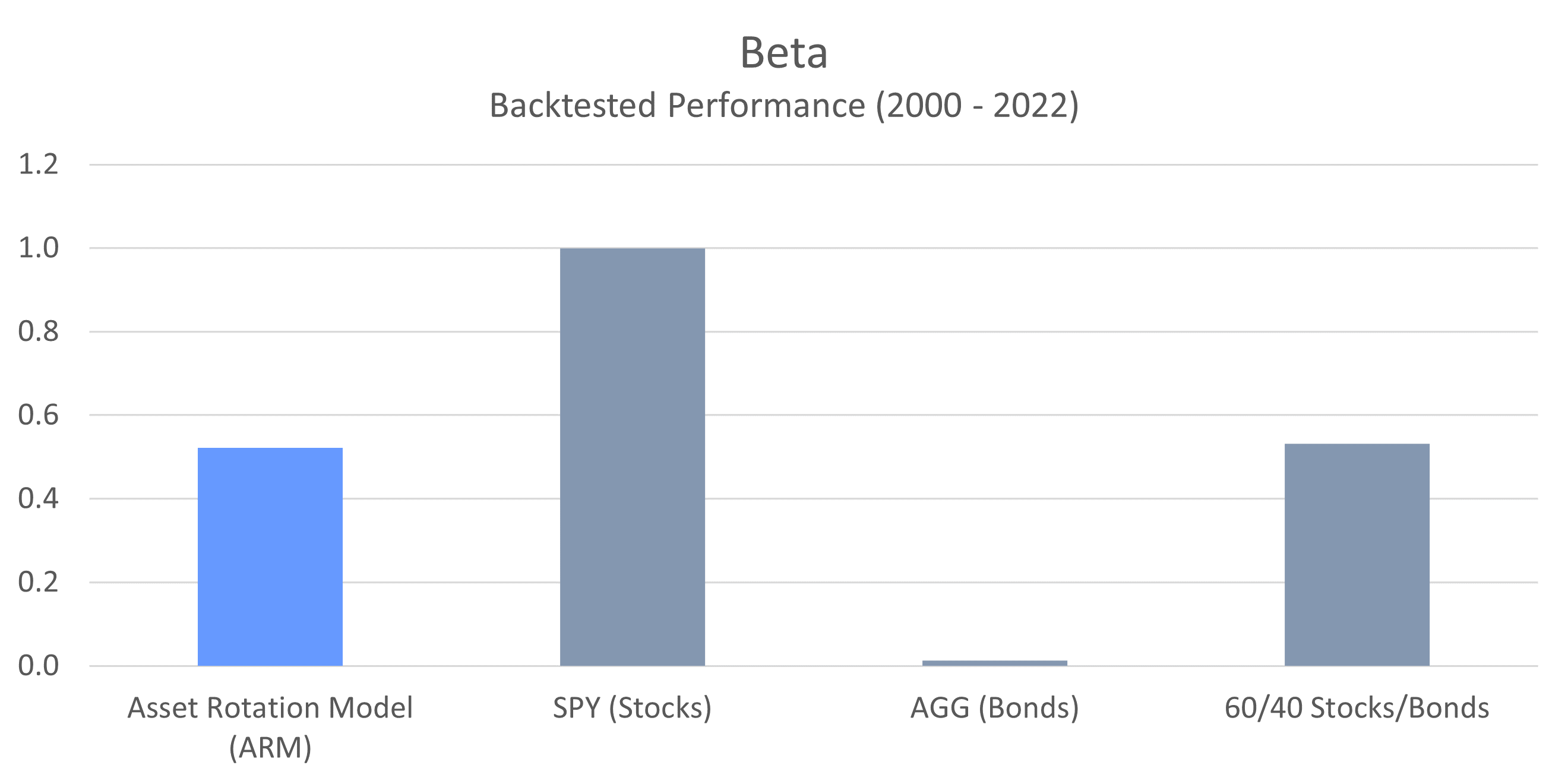
In this chart, SPY represents the S&P 500, so it has a beta of 1. The Asset Rotation Model has a beta of 0.52, which means it’s only 52% as volatile as a portfolio of stocks. Using this particular method for assessing risk, we can also see that the ARM’s volatility with respect to the S&P 500 is approximately the same as a blended portfolio (0.53).
At this point you may have noticed that bonds have much less risk than any of the other portfolios here. This is to be expected because generally speaking, bonds provide lower returns over time. Bonds also tend to be uncorrelated with stocks, which is why you see a beta so close to zero.
Now that we’ve covered the metrics that identify both risk (standard deviation, maximum drawdown and beta) as well as returns (compound annual return), we can combine these measures to get a better understanding of risk-adjusted returns. This is considered the holy grail of investing because it represents how efficiently capital is deployed. Anyone can increase returns by taking on more risk, but great investment strategies deliver high returns while taking less risk.
Sharpe Ratio
The Sharpe ratio is the industry standard method for measuring risk-adjusted returns. It looks at the excess return earned in relation to the standard deviation (or volatility) of those returns. With Sharpe ratios, a higher number reflects greater risk-adjusted returns (a good thing).
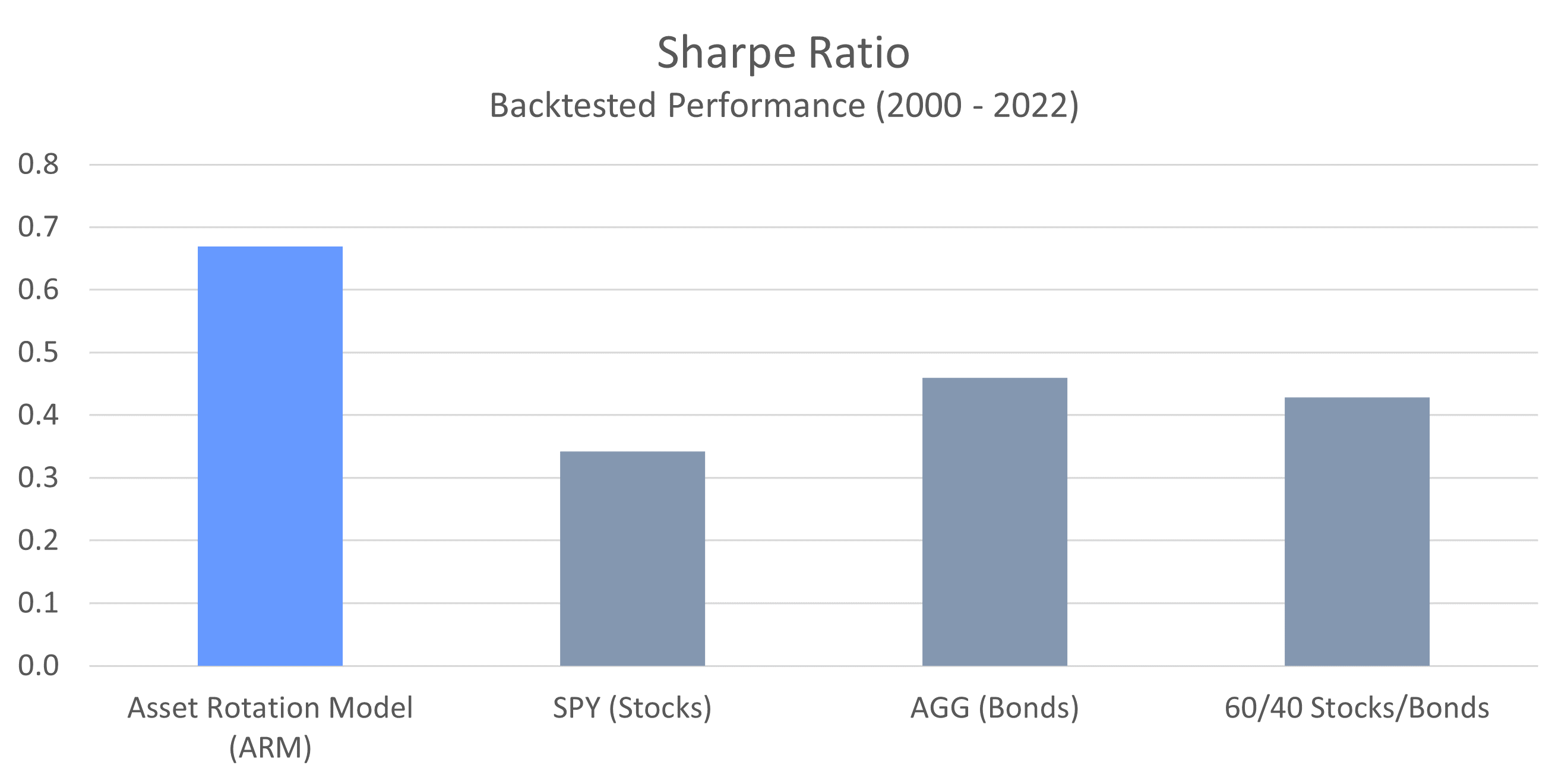
Here we can see that the ARM is able to deliver substantially higher risk-adjusted returns than both stocks and bonds, as well as a blended portfolio. The ARM’s Sharpe ratio demonstrates that the model is capable of deploying capital more efficiently and strategically than the other approaches.
When it comes to deciding how to invest, Shape ratios are an extremely important consideration because they demonstrate the true effectiveness of an investment strategy. Looking at returns alone can be misleading because you have no idea how much risk was taken to achieve those returns. The Sharpe ratio illuminates this important information, and gives you a complete picture of the risk-reward profile. Just make sure to view the Sharpe ratio in the context of the actual returns provided.
Sortino Ratio
The Sortino ratio is another measure of risk-adjusted returns that is very similar to the Sharpe ratio. However, instead of comparing returns against the total volatility of a portfolio, it compares returns against only the downside volatility (or risk). The assumption here is that volatility to the upside (higher than expected returns) is a good thing, and therefore shouldn’t be penalized.
As with the Sharpe ratio, higher values here represent more effective use of capital.
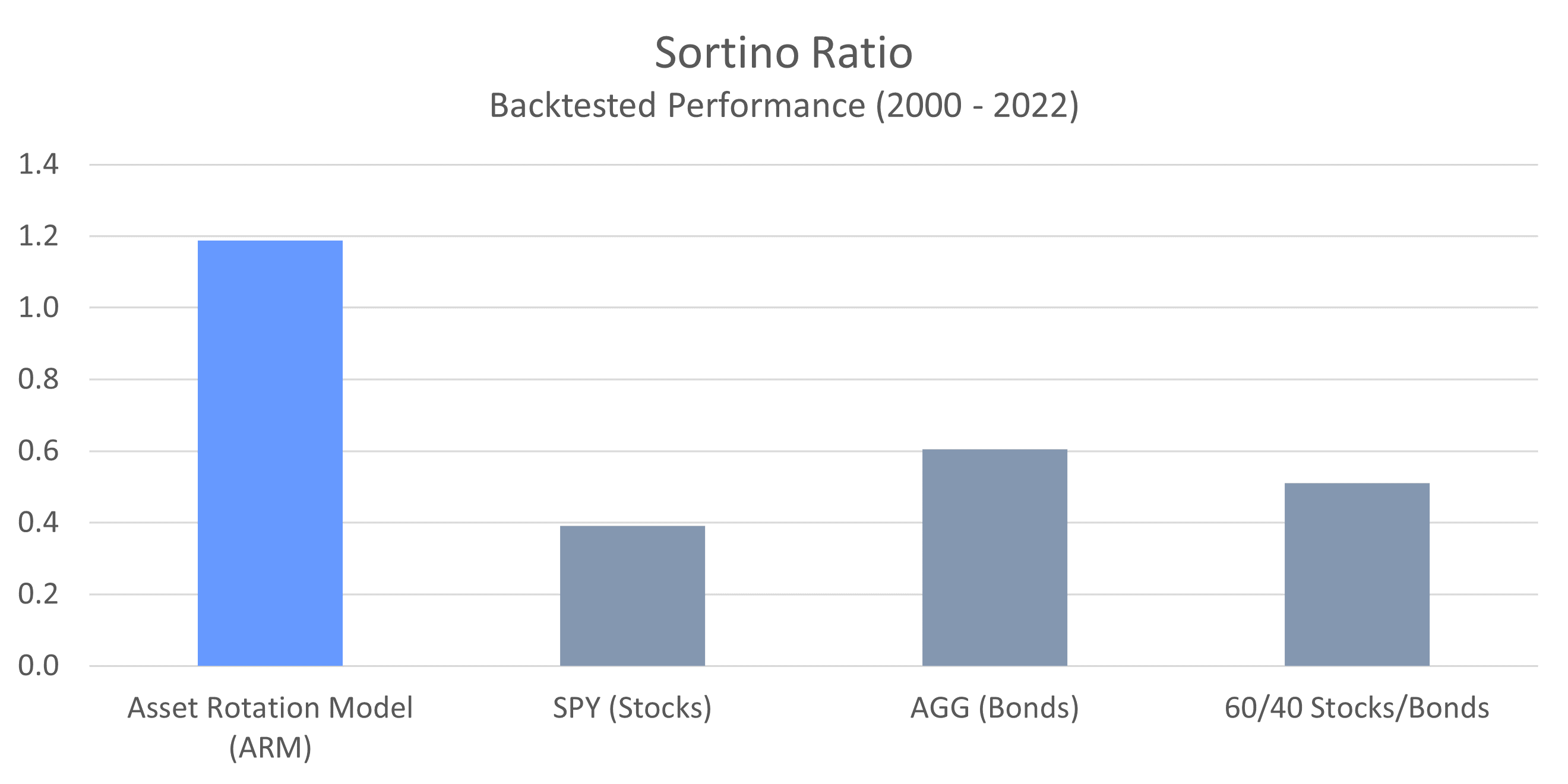
Once again, we can see that the ARM is able to generate significantly higher returns per unit of risk than stocks, bonds, or a blended portfolio. The relative outperformance here is more substantial than with the Sharpe ratio because of the fact that upside volatility is not penalized. This means that a significant portion of the ARM’s volatility comes from better than expected returns, as opposed to worse than expected returns.
Treynor Ratio
The last measure of risk-adjusted returns that we’ll look at is called the Treynor ratio, and like the previous two metrics we examined, higher values are better. In this case, the measure of risk used is beta. So we’re looking at the excess returns achieved with regard to overall volatility in relation to the S&P 500.
As you can see, the message here is the same. The ARM has significantly outperformed both stocks as well as a blended portfolio.
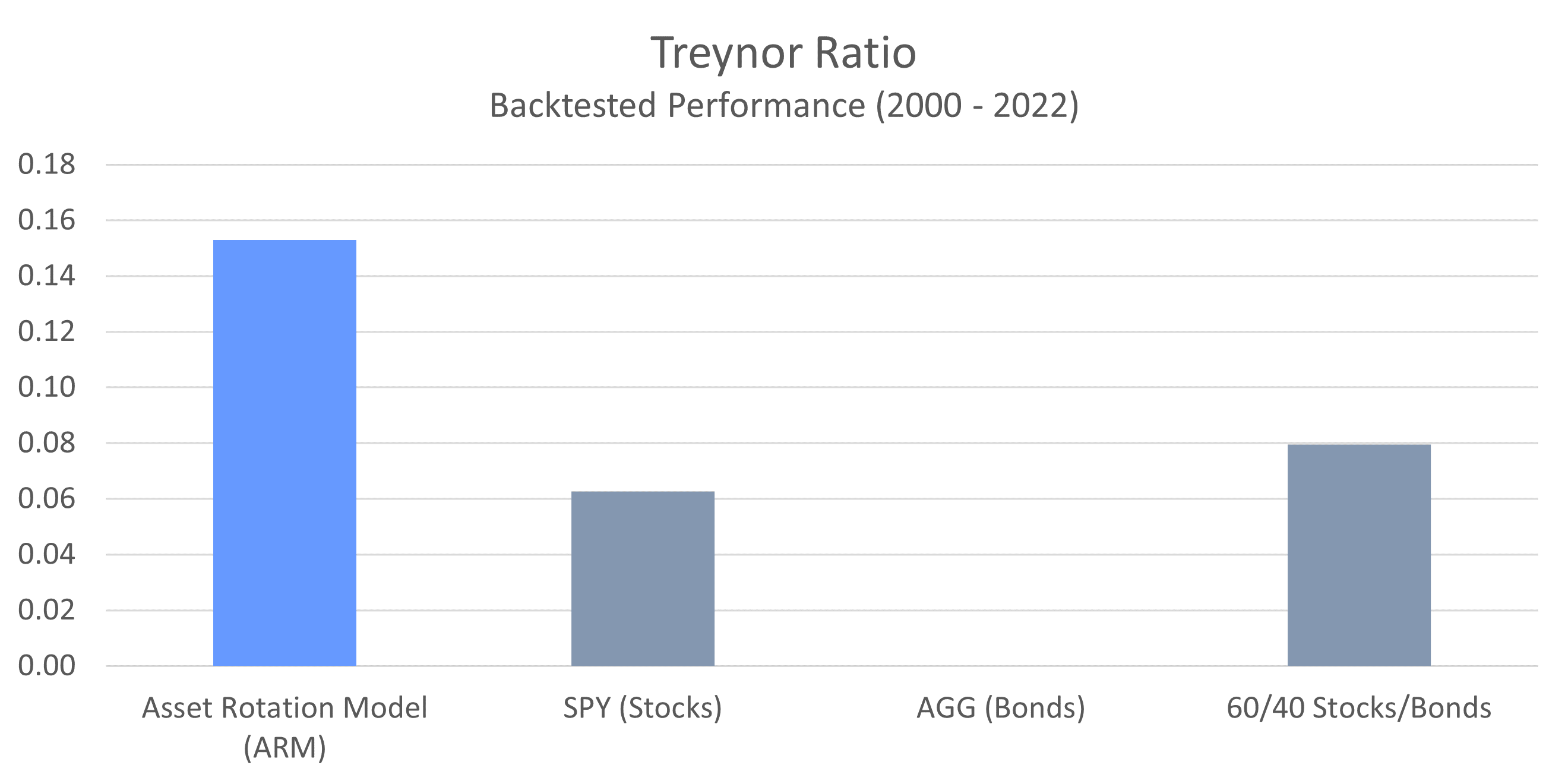
In case you’re wondering why no value is shown for bonds, it’s because the Treynor ratio looks at excess returns in relation to beta, and AGG has a beta that is very close to zero. This distorts the calculation and results in artificially high readings that are incongruent with the other strategies.
Alpha
At this point the only metric we haven’t discussed is Alpha. Alpha is defined as the excess return earned above a specific benchmark (in this case, the S&P 500).
What alpha attempts to do is answer the question: If an investment strategy experiences the same volatility (risk) as the S&P 500, how much additional return would have been earned above what the S&P 500 delivered? In other words, did the investment strategy add value to what would have otherwise been achieved by simply investing in an S&P 500 index fund?
Due to the nature of alpha, it does not make sense to calculate a value for fixed-income funds such as AGG. In addition, since SPY is itself an S&P 500 index fund, it will have an alpha of zero. We can see the alpha values for the ARM, as well as the blended portfolio below.
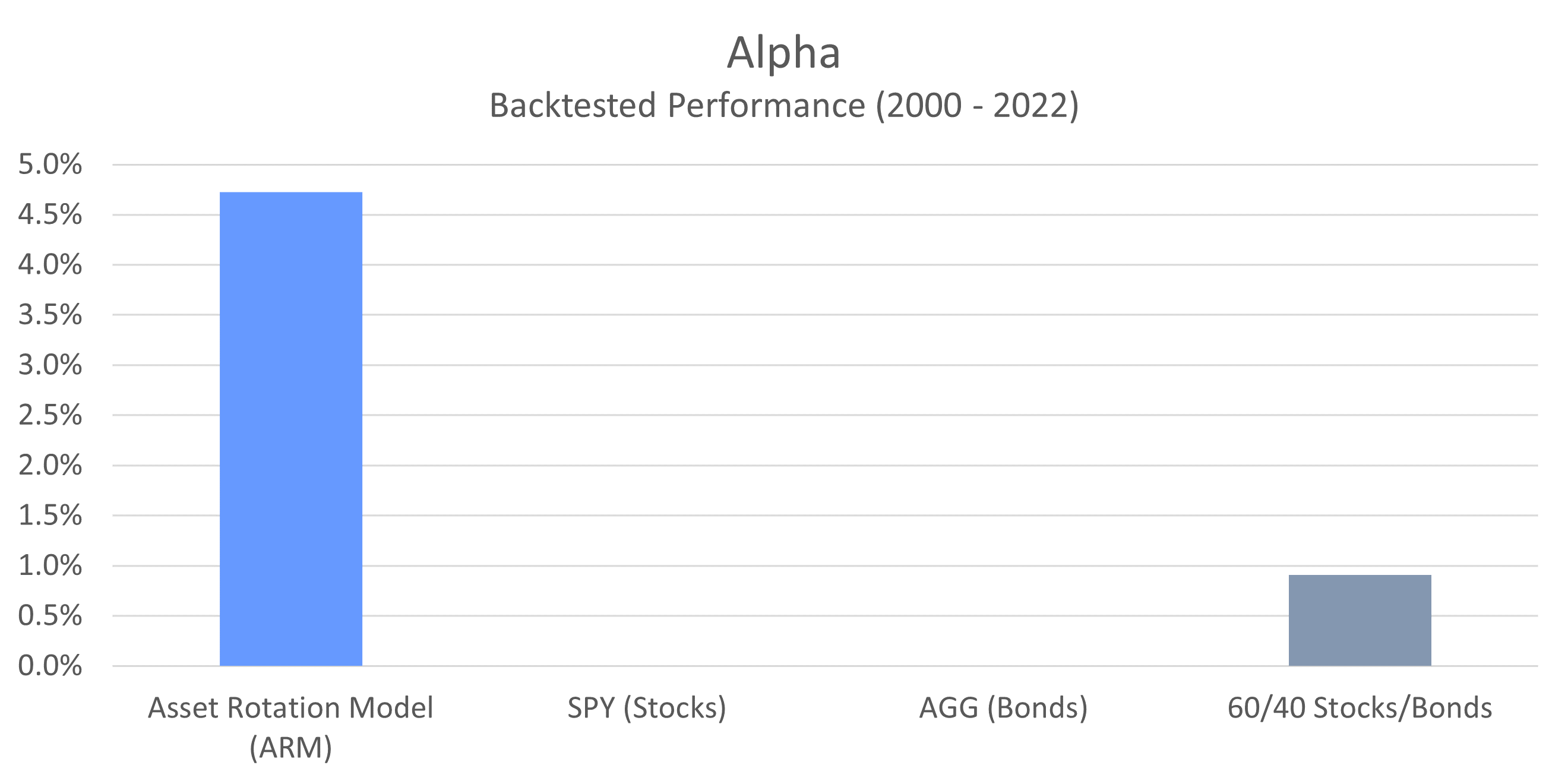
What this chart shows is actually quite eye-opening if you understand the data. It tells us that if the ARM had experienced the same amount of volatility as the S&P 500 (recall that it had a beta of 0.52, meaning it only experienced roughly half the volatility of the S&P 500), it would have earned an extra 4.72% per year above what the S&P 500 delivered. That’s an awful lot of outperformance.
In comparison, if the volatility of the blended portfolio were scaled up to match that of the S&P 500, it would have earned just 0.91% more per year than the index. That’s certainly a more effective use of capital, but it still lags substantially behind the ARM.
Conclusion
When it comes to understanding the effectiveness of an investment strategy, the metrics we’ve outlined here are critical because they offer a complete picture of overall performance. Rather than focusing only on returns, as most investment managers do, we’ve lifted up our proverbial skirt to show you the risk that is inherent in our strategy as well. As a secondary benefit, this performance data also provides you with everything you would need to compare the ARM against other strategies in an apples to apples manner.
By taking the time to dig deeper into the ARM’s historical performance, we hope you’ve come away with a greater sense of why we believe it to be the best way for those investing outside the confines of an employer sponsored retirement plan to manage their accounts.
Find Out How to Use the ARM to Manage Your Investments


